Map Author: CTMC
Origin: Map Link
Versions: MC = 1.18.1
Presentation
Mapwreck 4 - Twisted Regions is a full length CTM map. It was made under a week with over 30 mapmakers.
This map was played in multiplayer.
Overview
The Escape
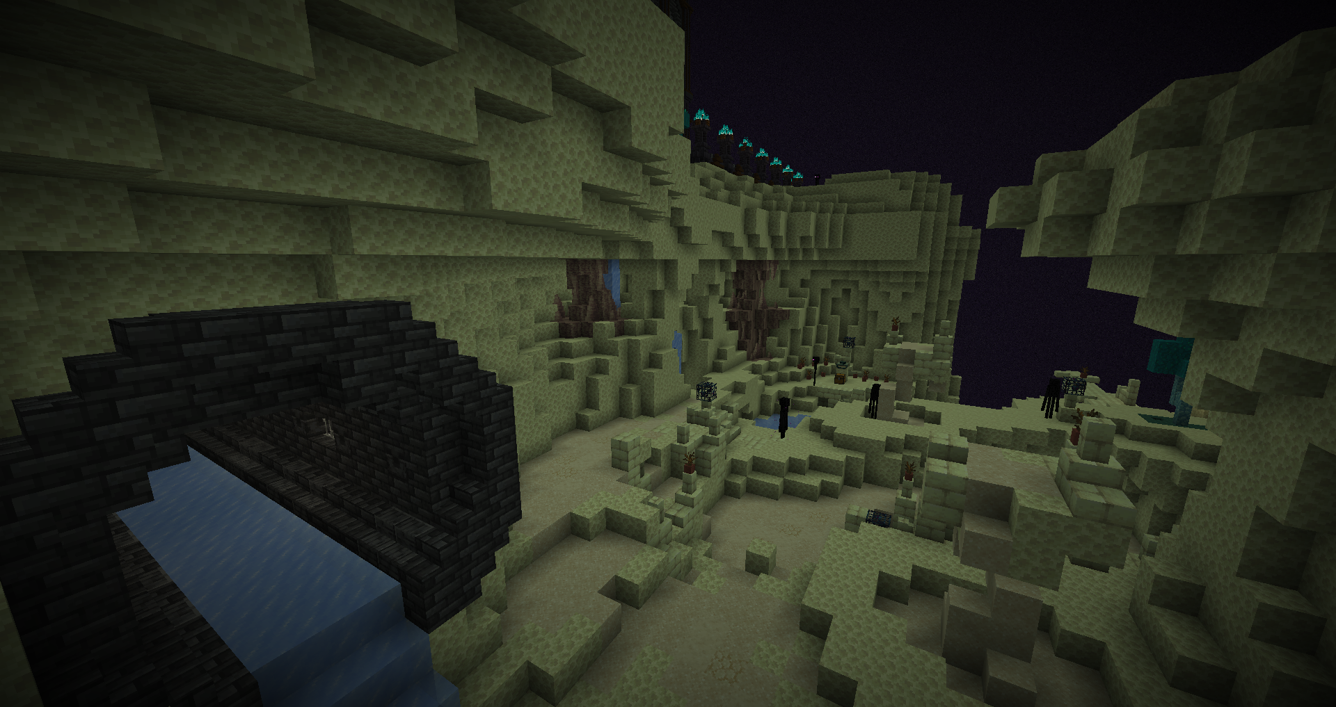
The start felt strange. The level is a bit chaotic and built like a normal ctm area, but it’s in adventure mode.
Molten Geysers
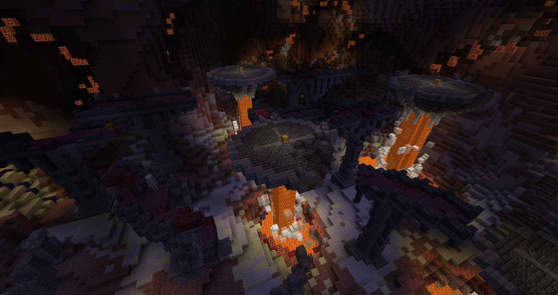
Walking into the portal got us teleported above the map, Cango fell to his death. Meanwhile I jumped to the monument directly after being a bit lost, so I never saw the area.
The Monument
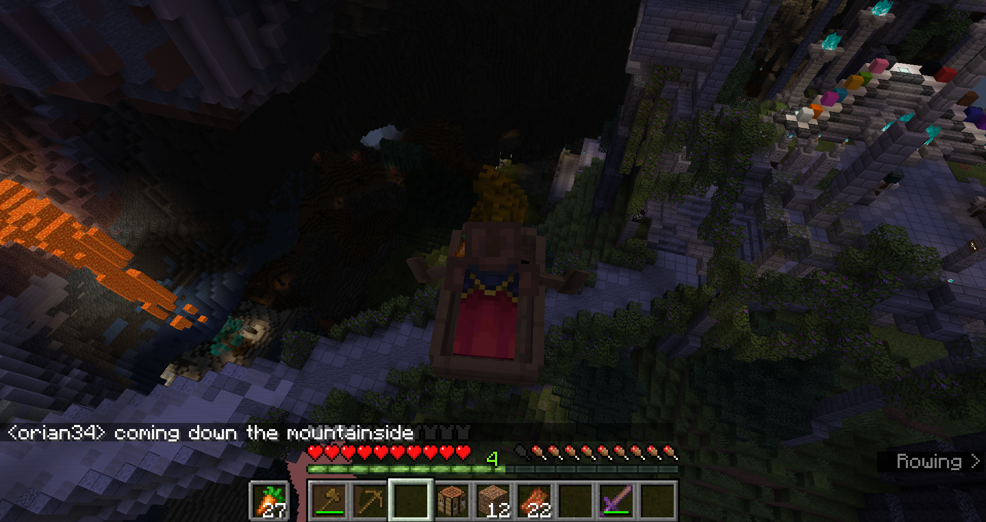
It’s a nice hub area, although a bit too large for the content it has. It’s fun exploring and finding stuff.
Azalea Ruin
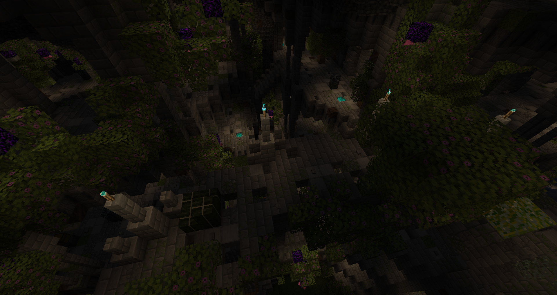
It had an interesting layout to navigate, a nice first area to tackle. A bit repetitive for the ring segments.
Prism Caves
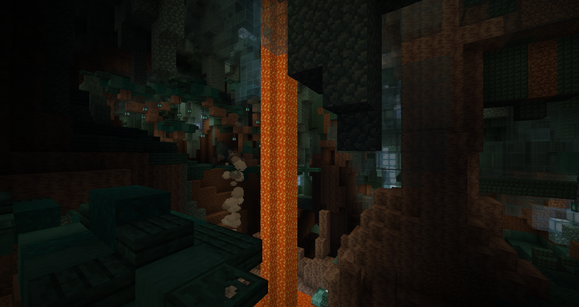
Pretty cool overall, the larger than usual detection range is interesting to push forward combat. I like it when areas have various paths to enter from.
Mine Field
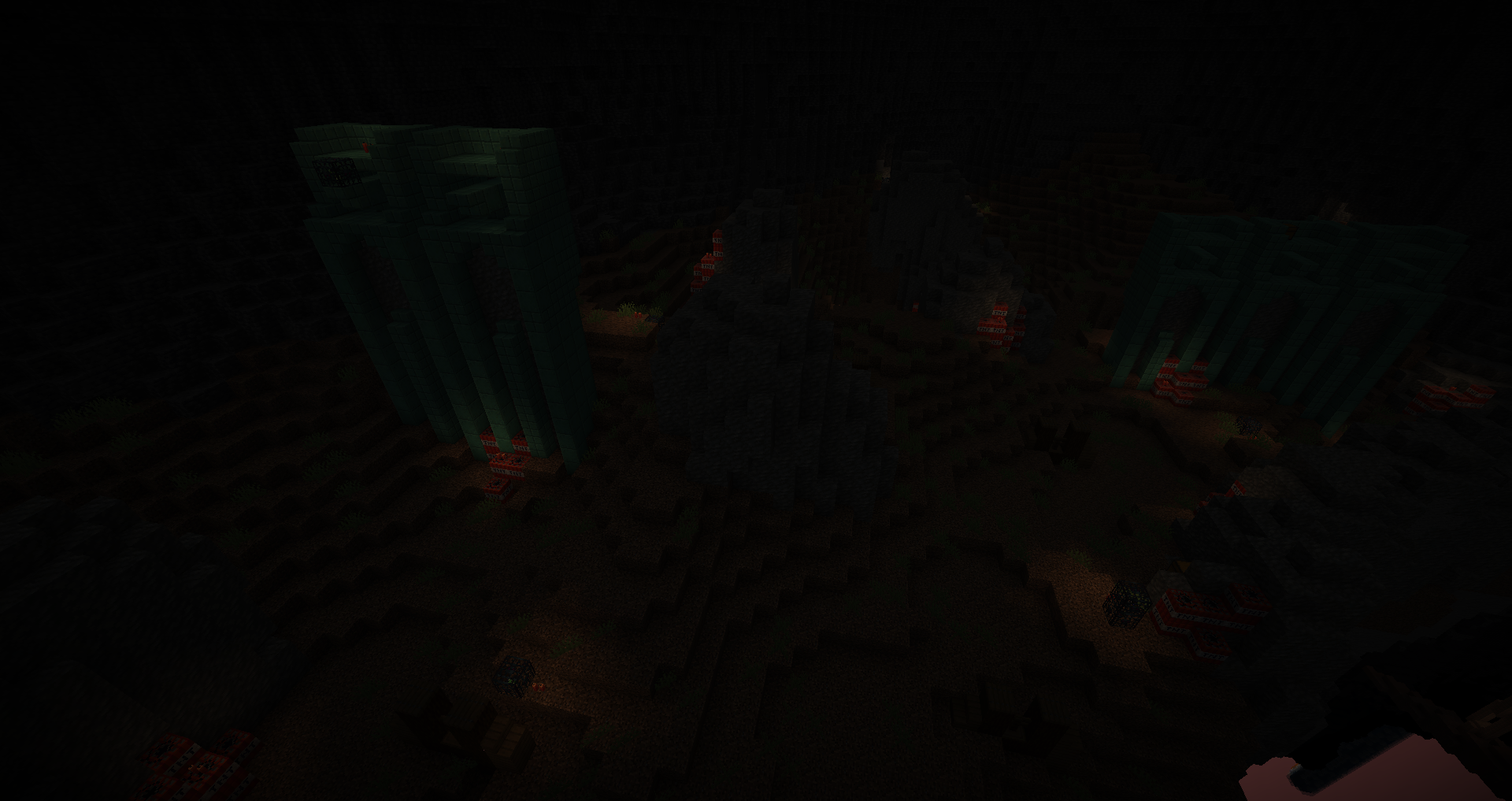
It was unique and fun. I was surprised by the hidden second half.
Misty Descent
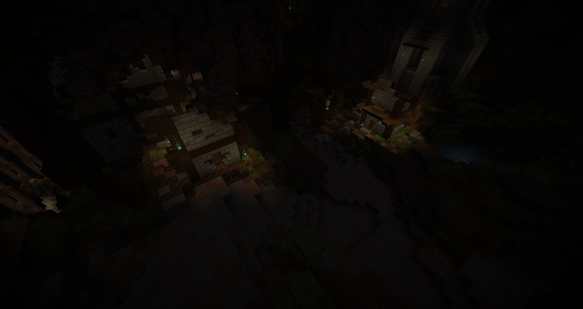
Simple but effective level design, good variance in gameplay.
The Tainted Oasis
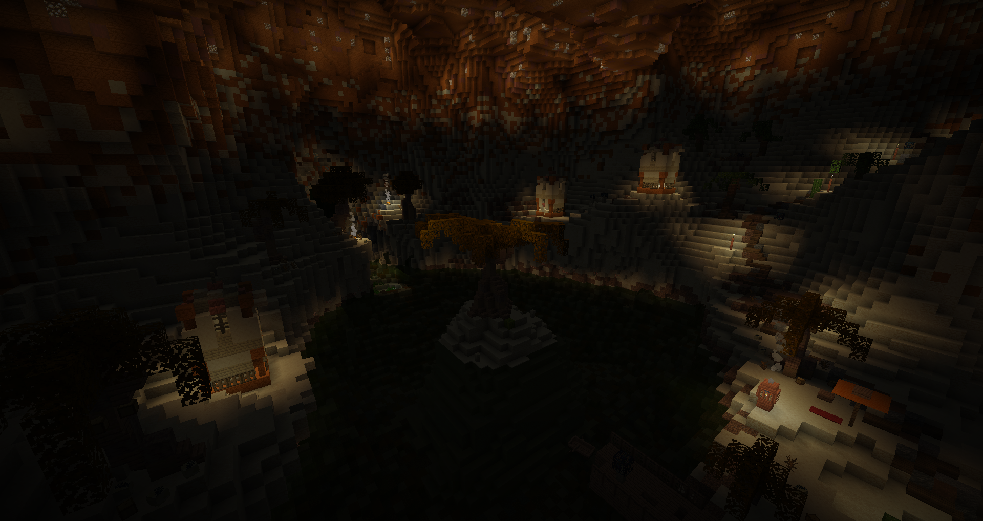
The paths were too large, it was too easy to just run past the spawner trail. Also the poison water still affected me while in the boat. The blockvar is a bit too busy imo.
Frozen Arches
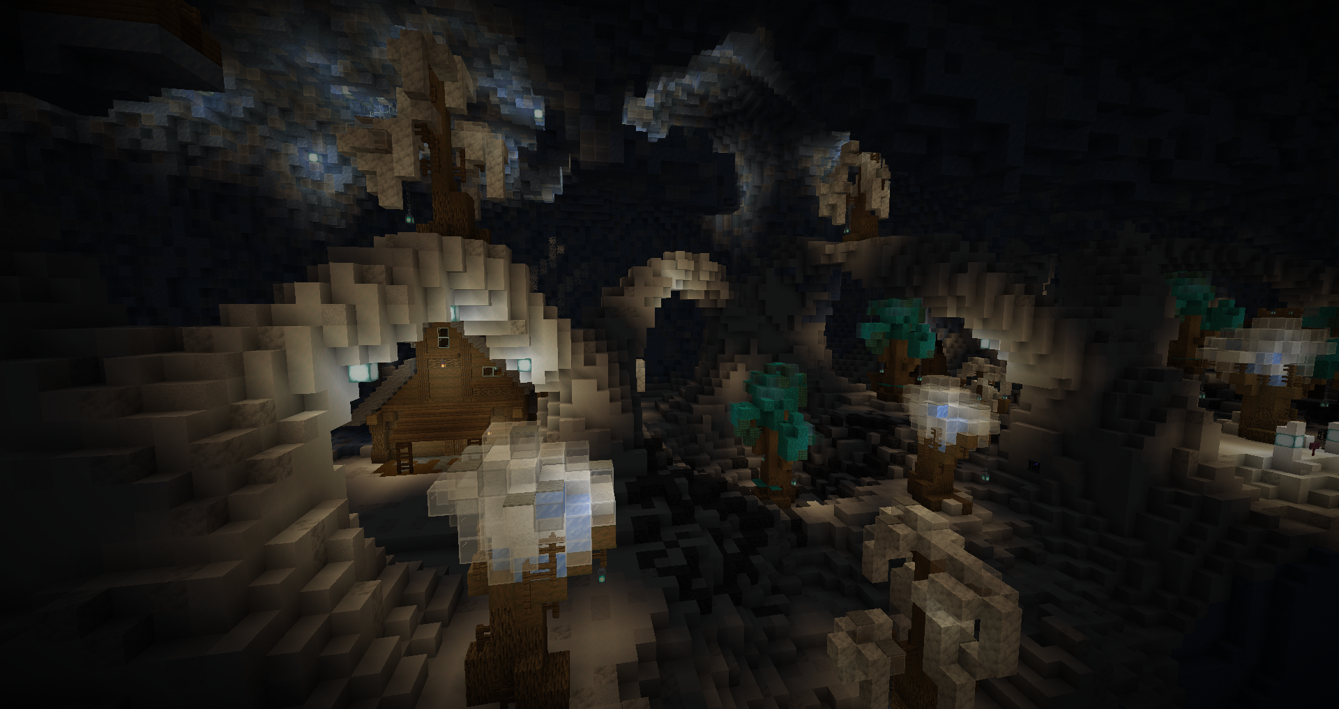
The terrain was hard to navigate, even in the interiors. I appreciate the lower speed baby zombies, made them more tolerable. The snow traps were too deep, annoying to dig out of.
Mycelial Badlands
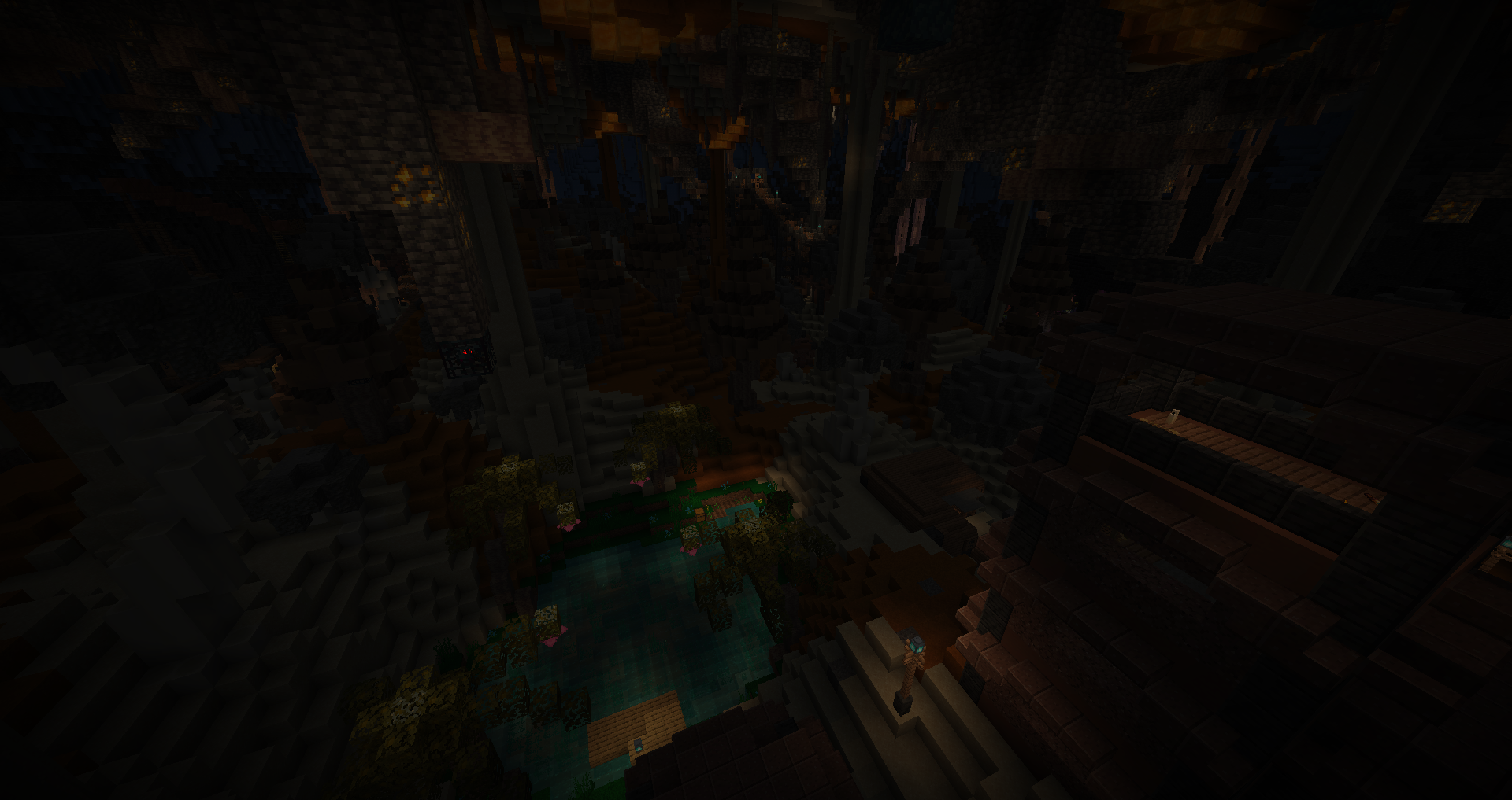
The mobs and spawnrate felt overtuned. We were a bit miserable going through it, had to wander for a while in the dark or accidently torch myself to death.
Magician’s Hideaway
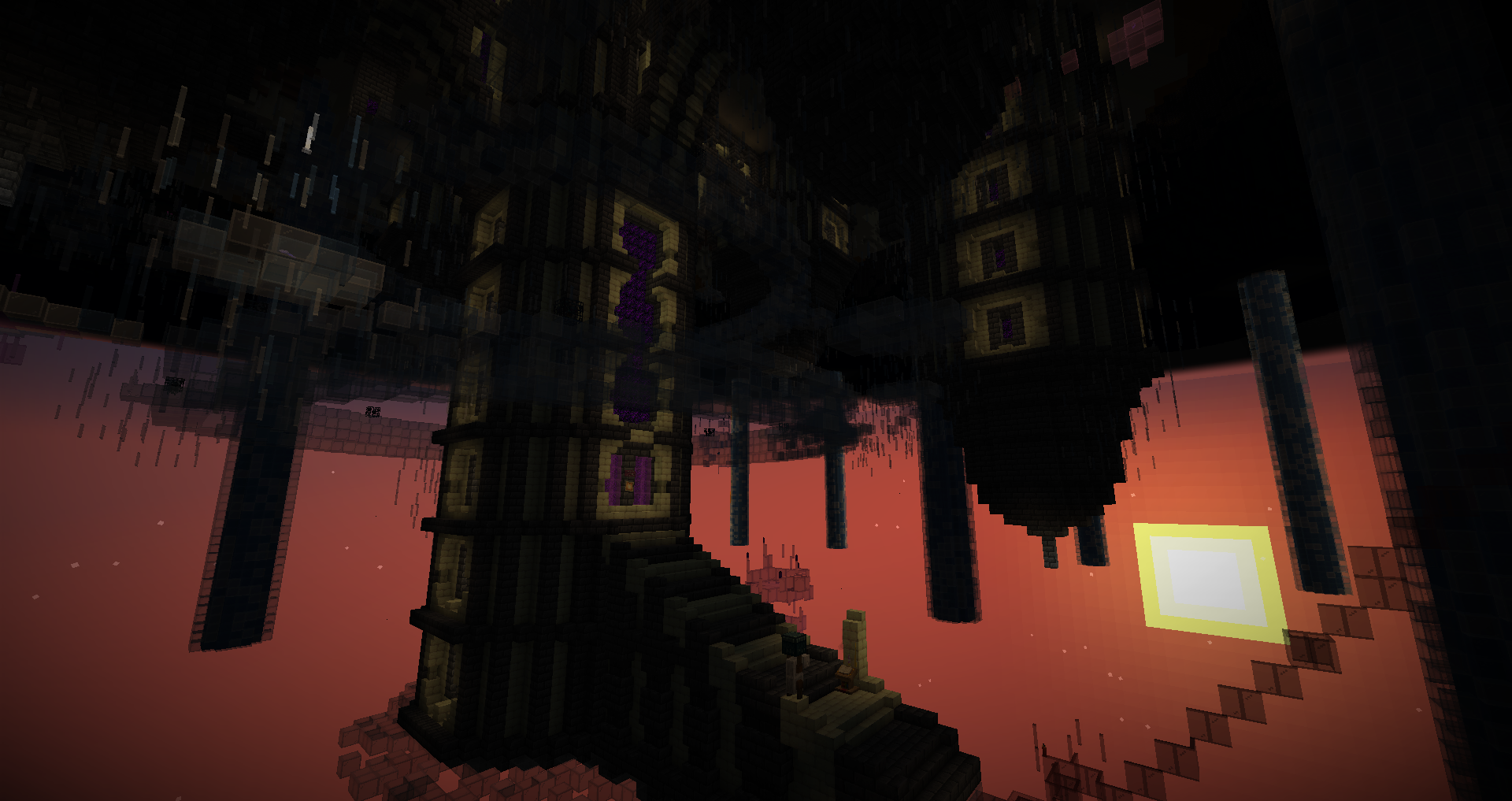
It was pretty tense and fun with a wacky layout, items and mobs.
Chantry of the Singularity
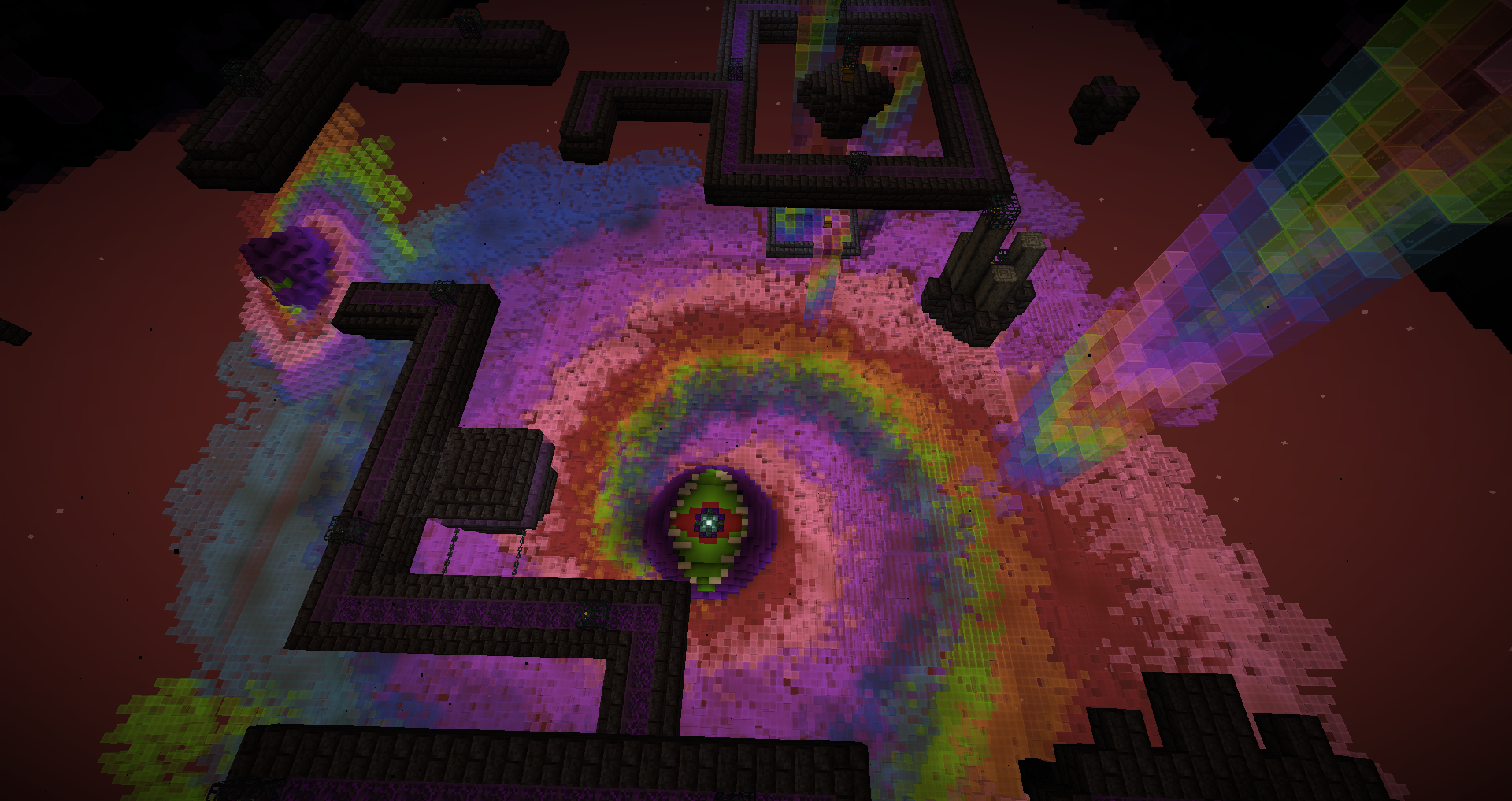
The giant room needed more variance. The bottom part was like a jump boost area but without the permanent boost. It was a bit of a drag due to having to bridge while fighting blazes. Overall I think it was more a flawed design than execution here.
If you make a mandatory mechanic, you need to give it at the start of the area and not in limited amounts, because it won’t be used otherwise(or running out midway).
Looks unique.
Bottomside Lighthouse
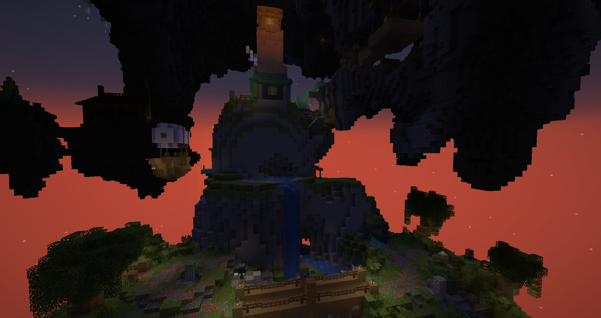
It was a cute and short area. Also ohno, is that natural spawns?
Angler’s Dwelling
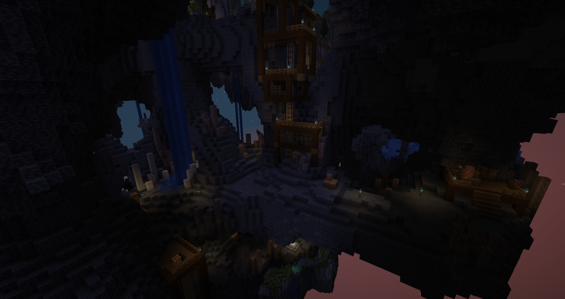
A bit confusing, didn’t end up doing much here personally.
Tropical Trials
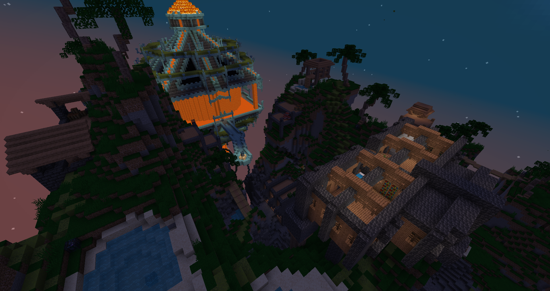
The nat spawns really started being a major nuisance here. Lots of mobs overall. It felt like the latter half was made for an un- map, even more with the blazes making lava flow everywhere.
Celestial Archipelago
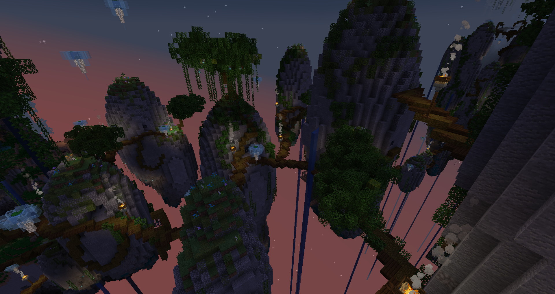
Bit confusing to move around, stressful due to void. It was fine. It could’ve been more pleasant with larger paths.
Ice Route
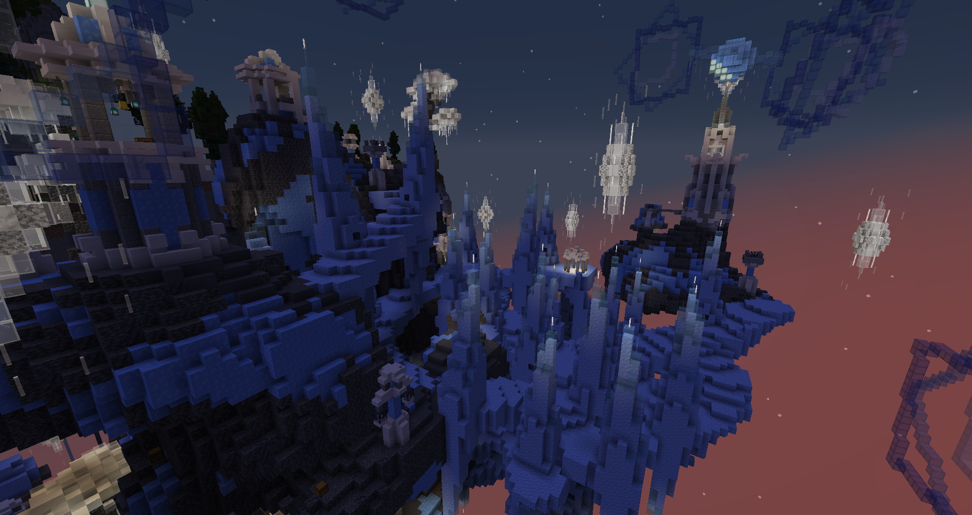
There were stressful areas before, but this one is mean. Super punch skeletons on ice, oh dear.
Crystal Dust Quarry
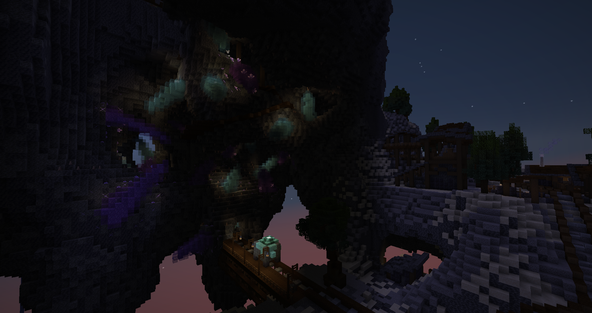
The area was more carto spam than a carto area, proving “carto spam” to be a fallacy.
Every mob is elite tier, and even at two people, we were extremely overwhelmed by the sheer amount and strength. Even more when they combined with the overabundant natural spawns. So many creepers… Somehow the piglins duplicated raw gold and golden apples, so we ended up with many stacks of those.
The effort is praiseworthy. If only the custom mobs were toned down a lot; they’re all individually great, having each all together is the problem.
Colorless Land
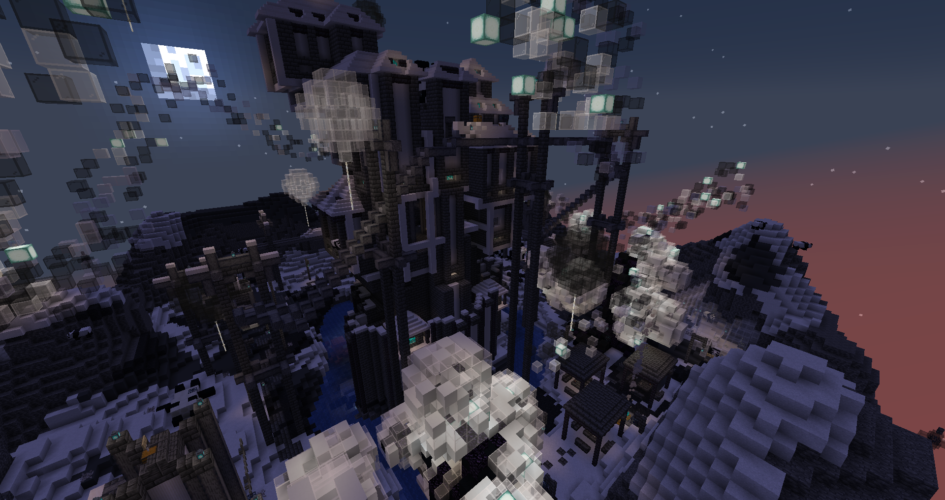
Strange layout, very spread out so it’s simple to bypass a lot. The mobs were a relief after the grinder we went through. The items had some conception mishaps.
Strange theme, unique though.
The Shrieking Mists
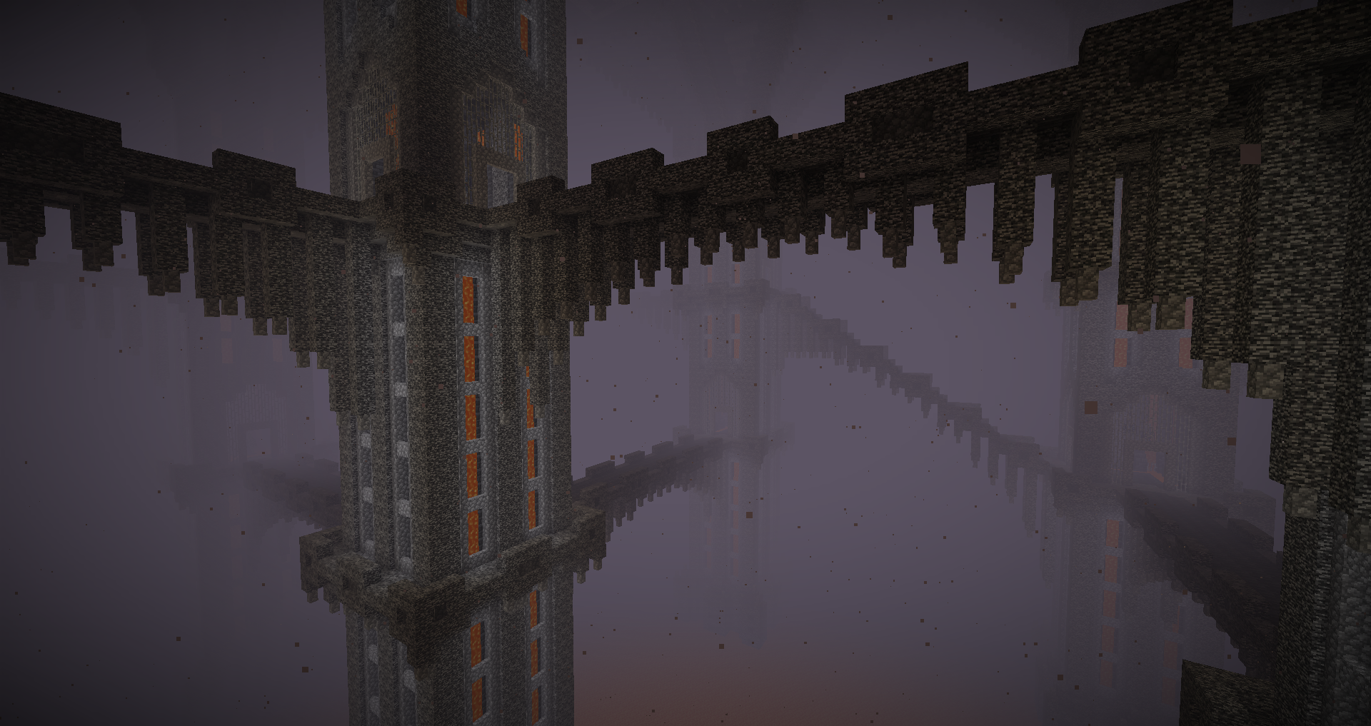
Was fairly interesting, until the wool box segment. That was an intentional un- map design, and it was the worst experience in the map so far. That’s coming not long after cyan’s mobs and it made me regret it.
Basalt Fields
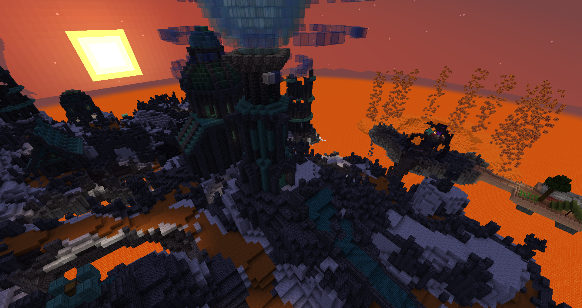
Pretty good and simple. Familiar sights. The charged creepers in the nat spawns are a bit eh.
Jester’s Mirage
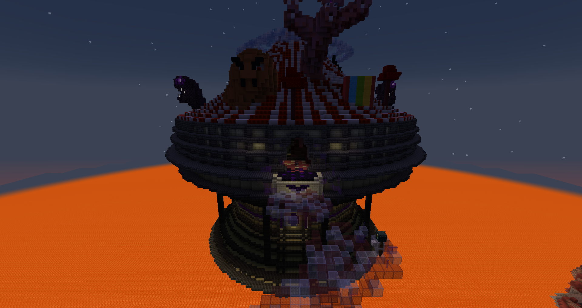
Every mob manages to be cursed in some way. Other than that, short area. The jester head is absurdly broken even by broken standards.
The Starved Ruins
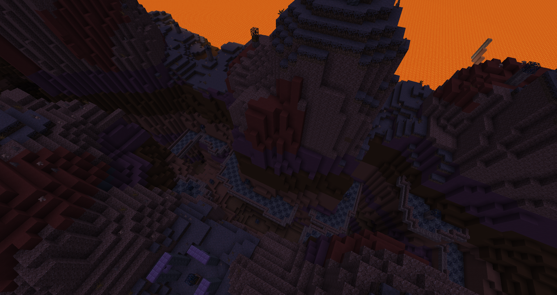
Very fun, fairly balanced loot and mobs. Bit of a whacky layout but that made it fun to explore. Great area.
Daredevil’s Keep
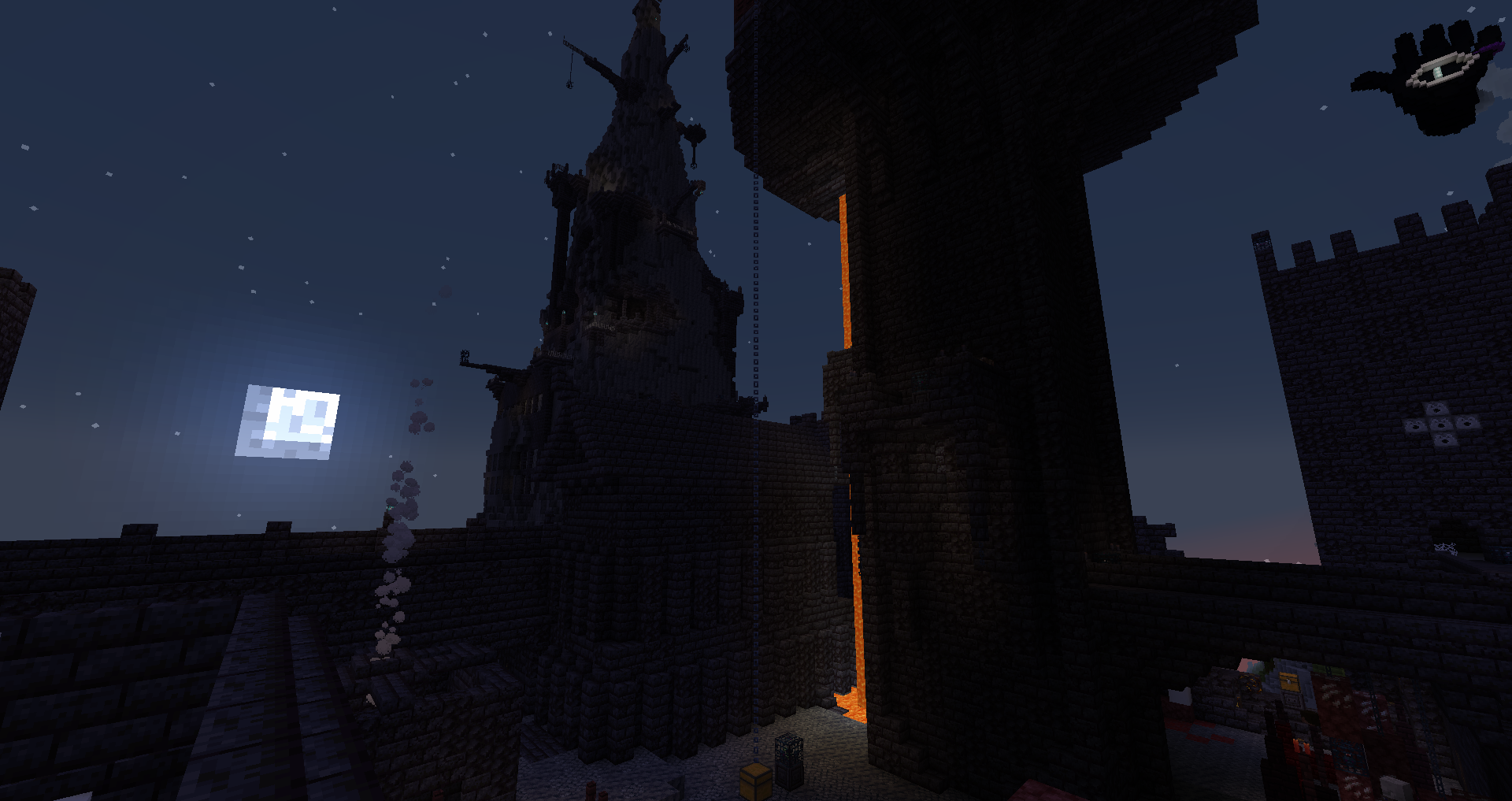
Where did balance go? Armor loot is subpar, the mobs are spammed and overly strong, very high numbers all around. The ravager button is very bruh(I broke the block but it still triggered).
Cyberlight Citadel
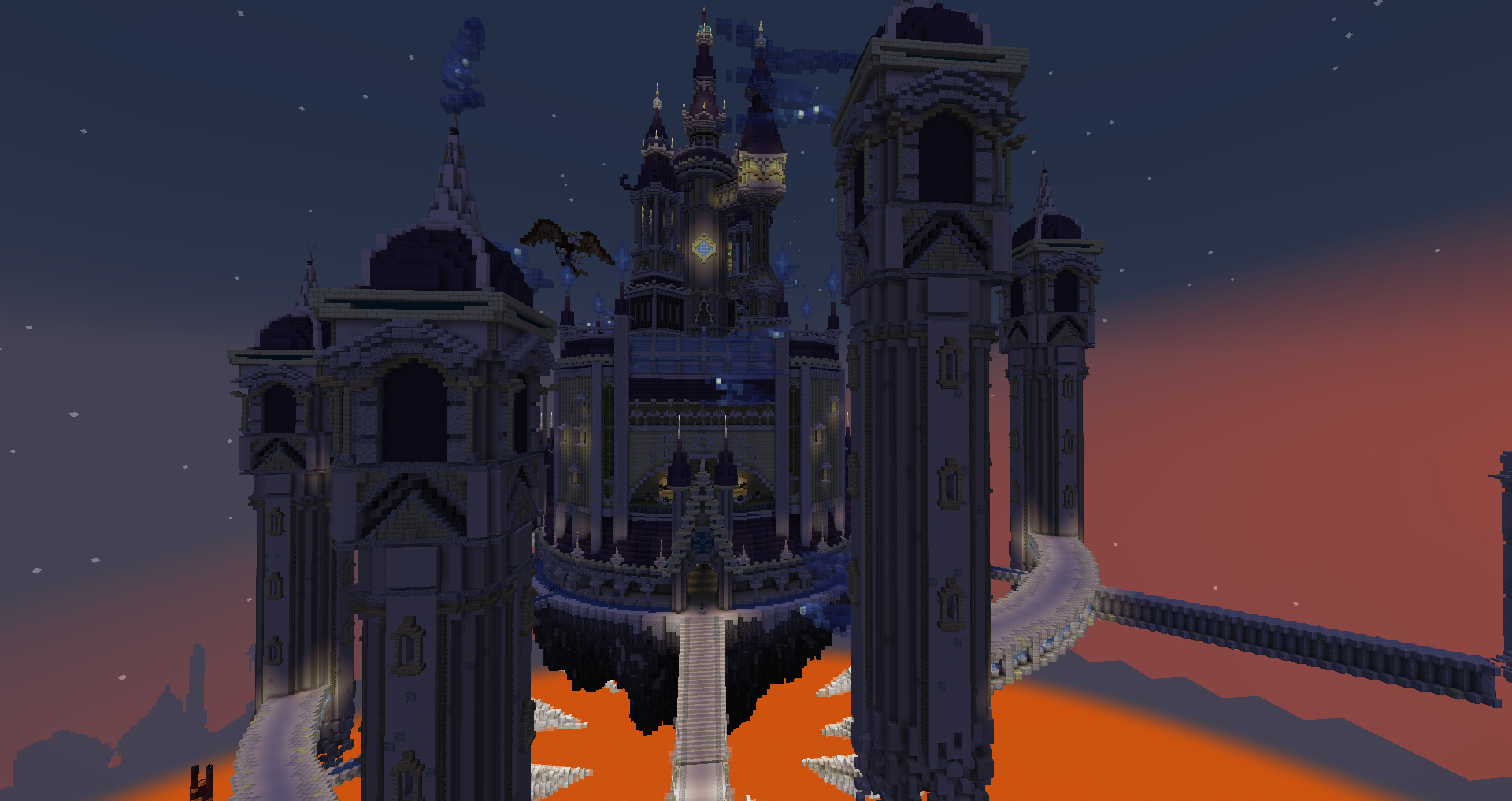
Excellent area in level design and aesthetics. The mobs are the big problem, they were overtuned and overall too tanky. If stats were smaller to make it tolerable, this area would be easily the best one of the map.
Crimson Cast
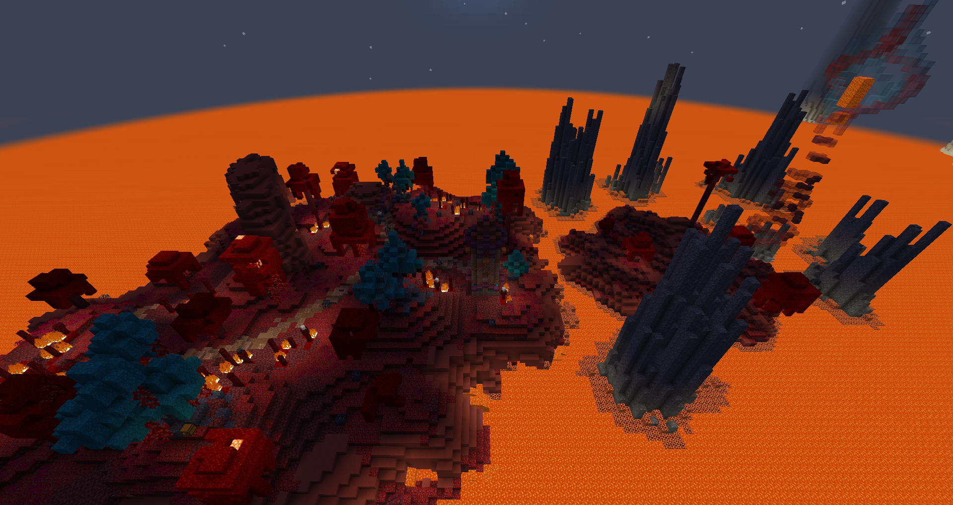
It was more interesting than expected, thanks to the shard dungeon. Loot is weird due to being after red but weaker than it.
Purpur Fortress
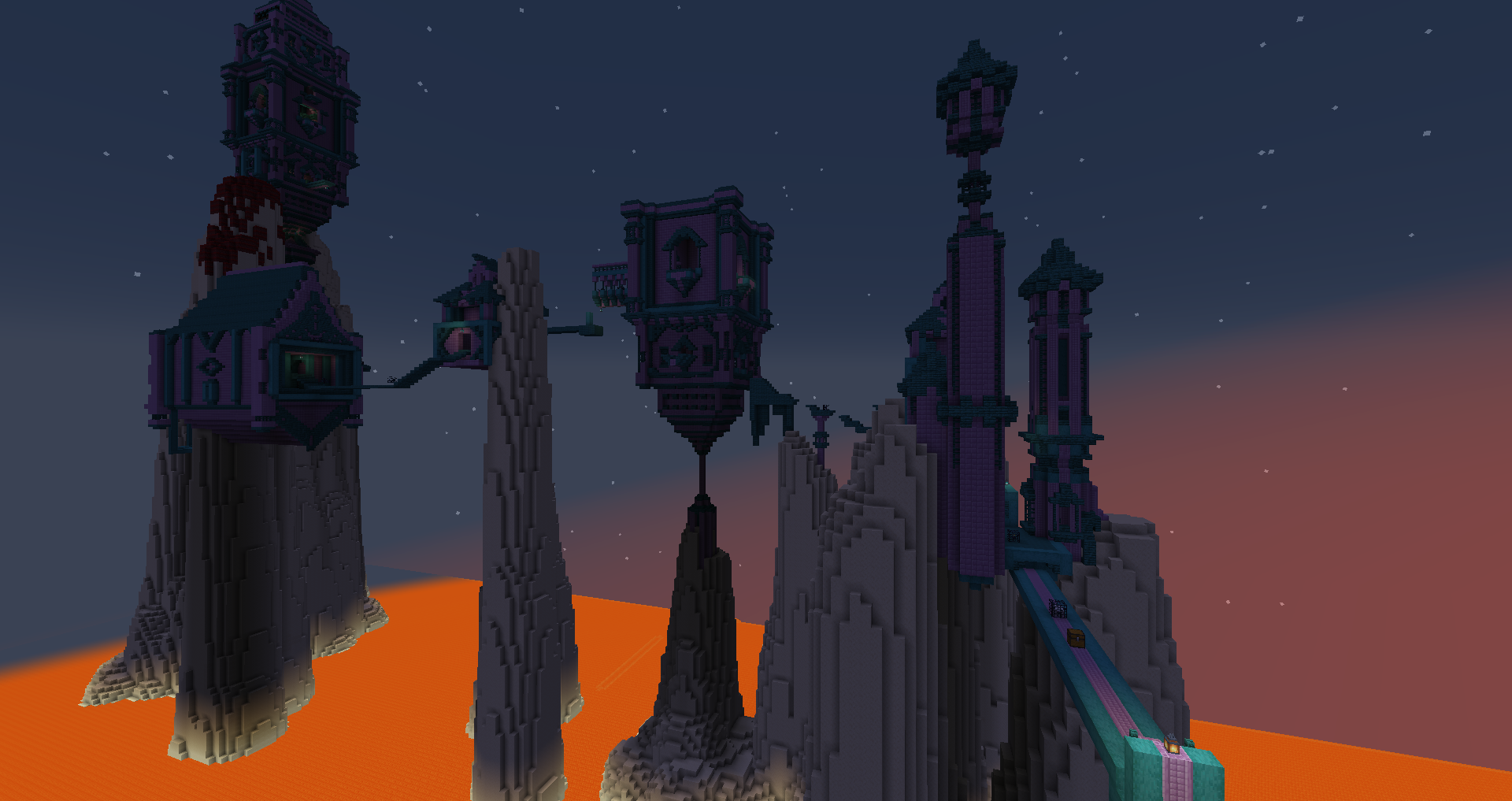
Another random bonus area, the loot is worse than red so we just did it for… the sake of it I guess. I dislike jump boost so it was eh. Limiting it is not a good idea either for multiplayer. Flashbacks to the Chantry.
Inferno Chamber
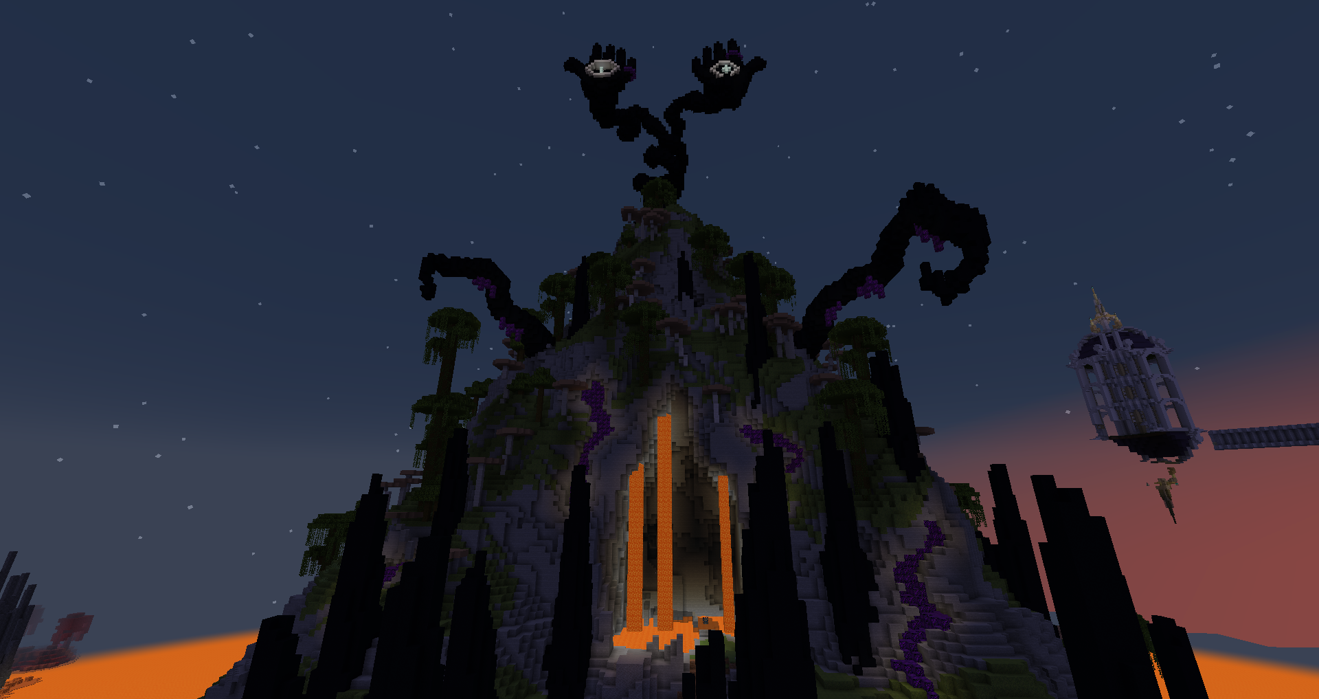
It’s a thing I guess. Neat look from the outside.
The Abyssal Prison
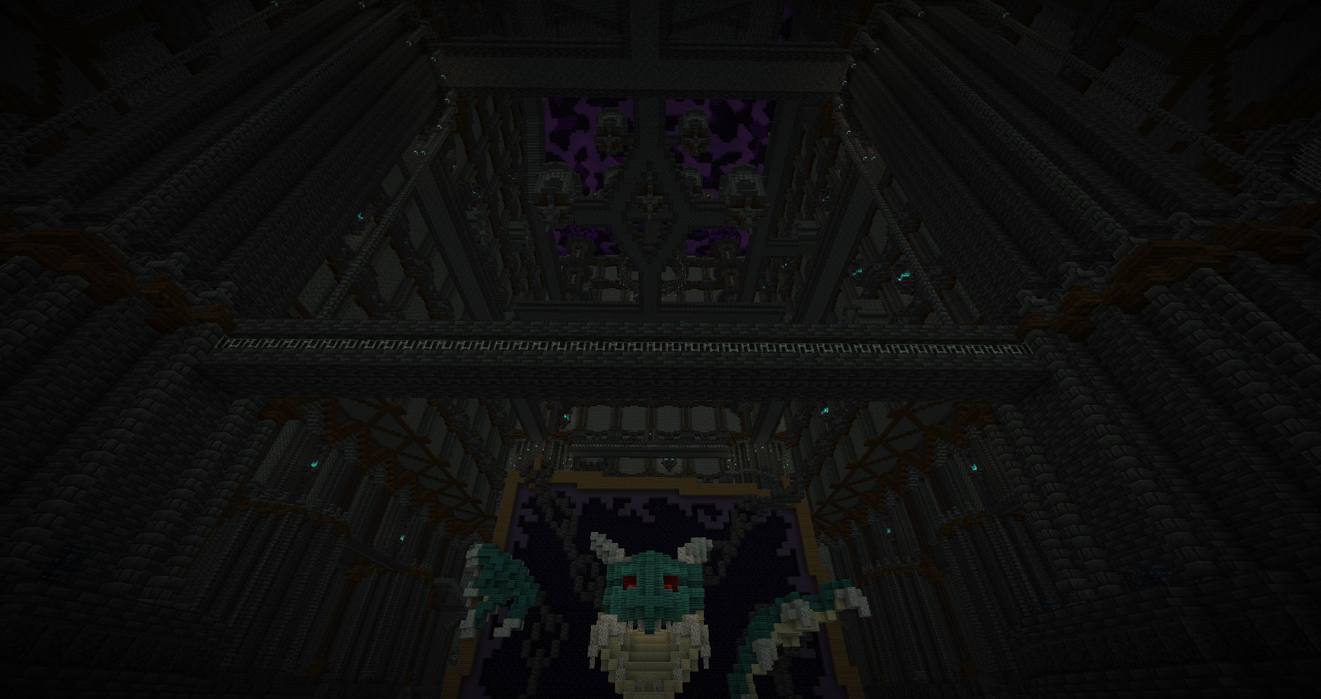
The final gauntlet, the level layout is very perfunctory, with spawner trails to the wool. The combat is not as terrible as you could think, and with the loot it’s fairly even. Pretty boring overall(better than being a nightmare), it looks quite good. I think it should’ve had a random dragon roar periodically for epic ambience.
Conclusion
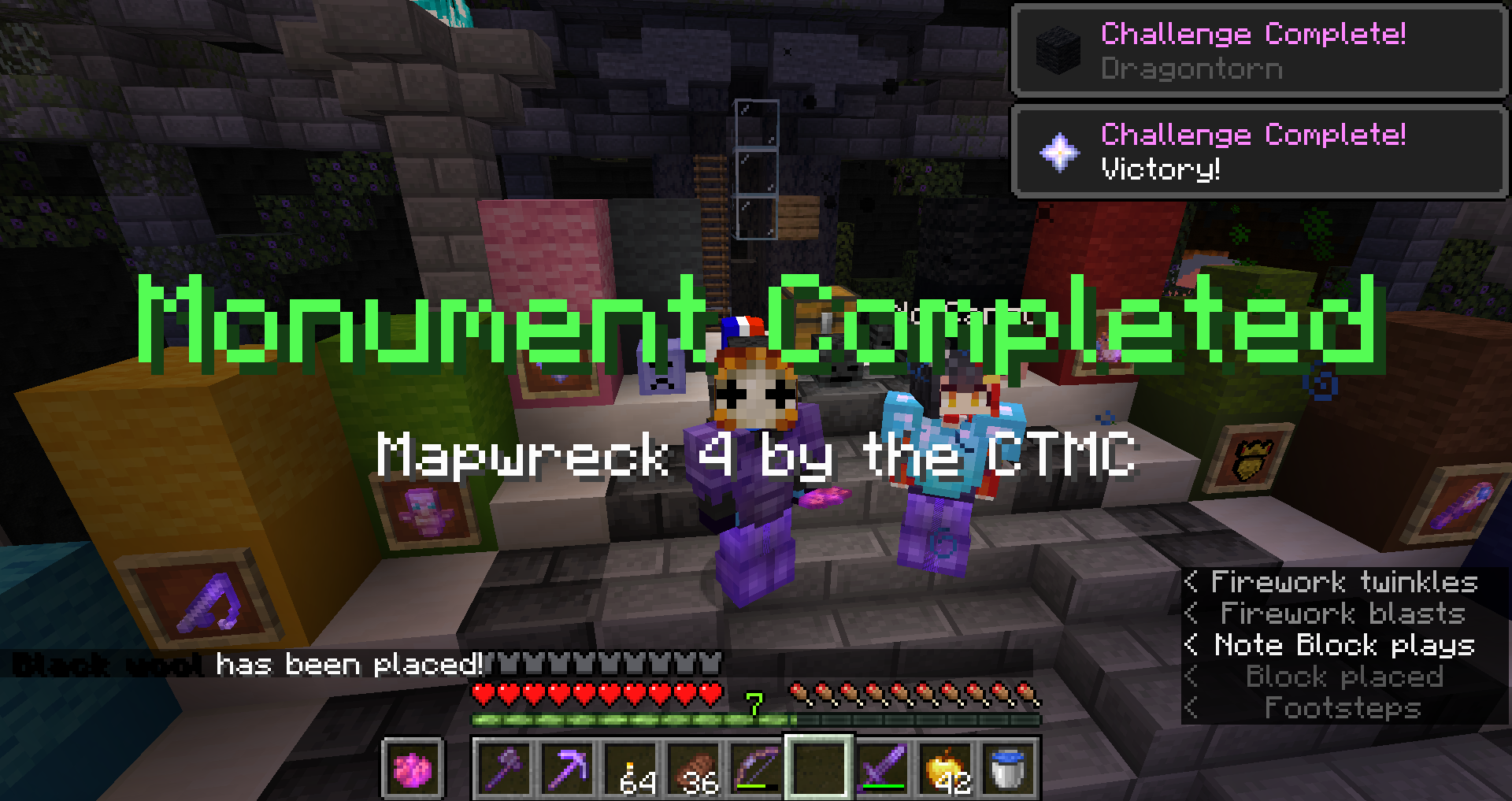
Halfway through we updated the datapacks, getting void protection and graves. That helped a lot to make it less brutal.
First things to get out the way because it’s a mapwreck: the area gear progression and mob balance is uneven.
Sidenote on the fact that no Cartographer or Item Builder datapacks were used, and despite that, I think the map managed to fall in many pitfalls people usually warn about for these datapacks. Cyan especially had übermobs for every mob type. You could still find ridiculously OP items, which ironically went overboard more easily since you didn’t have the variety and limitations of the premade datapacks.
I think in the end, this map served to prove that it’s not the tools the problem, it’s how things are made. Next time, instead of restricting design options, we should simply curate more the results.
The natural spawns were a major annoyance, and somehow they’d spawn near you if you’re several players.
Now, the relevant point about this map in particular - the different way to make areas that was tried here is detrimental. It created an even more chaotic map with lots of extra area bits.
I much prefer having the defined areas with an objective each. It accelerated area fatigue without making you progress more, as well as making you wonder why it was worth going through. Event maps already suffer from overscope, I don’t think this was the good answer.
I have to complain about the bonus objectives as well. Too often, the shards were hidden next to the objective, which isn’t the best for content repartition. Bonus objectives are best done in a way to promote exploring side paths and places you wouldn’t go usually, this wasn’t it. Same for the netherite block, barely worth mentioning. That makes me want to handle them next Mapwreck…
So, what to say? This is a mapwreck map. I haven’t played the third yet, so it’s hard to judge, but there’s a good chance it ends up near the bottom. Hard to recommend due to the very uneven balance, but if you like playing mapwrecks, you might enjoy it.
Let’s make a better one next time!